A simple Material Design ripple effect for any iOS view
Some time ago I had to create a background color transition animation for an iOS app I was working on. This animation was pretty similar to the ripple effect Material Design buttons have. I thought it would be a fun idea to go back and revise what I had done, change the animation so that it looks like the Material Design ripple effect and create a UIView category with it.
This blog post shows an implementation of this animation that can be applied to any UIView.
De-constructing the ripple effect
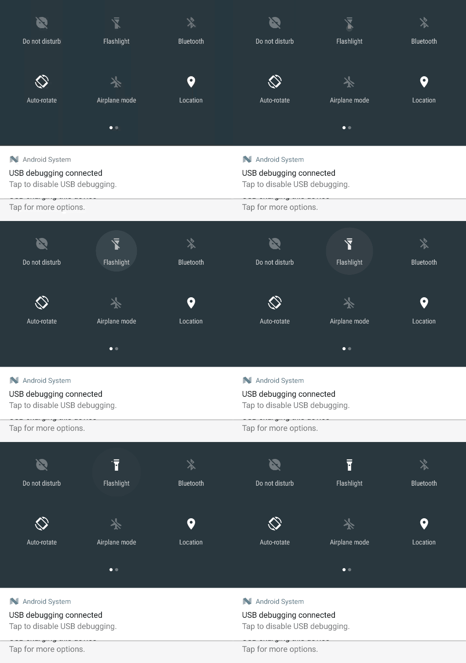
Before implementing anything we have to know exactly what it is we have to build. So first things first, let’s look at the ripple effect in slow motion. For this, I set the animation scale for all animations on my phone to 20x and recorded what happened when the flashlight tile is tapped in the quick settings menu.

The Ripple Effect in action
The effect seems to be rather simple, a semi transparent circle starts expanding where the tile was touched, only to start fading out before it reaches its maximum size. If we take a closer look we can also see that the expansion doesn’t seem to be uniform, it seems to expand rather quickly at first and then slows down towards the end.
Constructing the ripple effect
Before we start writing any code we have to decide how we are going to be implementing this. Is it going to be a subclass of a particular UIView? Is it going to be a new type of UIView that we can add as a child? I opted for none of these, instead I decided extending UIView with a category would be a simple but effective idea. By creating a new category we can add this effect to any UIView seamlessly and without any trouble.
Now that we know where this is going to be coded we need to figure out an API for this animation. For now this implementation will be uncomplicated. For the animation there are a few things we need to define.
- A position to serve as our starting point for our animation.
- The color we want our ripple to have.
- How big we want our ripple to be.
- How fast we want it to expand, or rather, how long we want our animation to last.
- When the ripple should start fading.
At the end of this post you can find a link to a repository holding all this code, but lets see how to build this first.
Our UIView Category will look like this:
Our animation will be taking place in a new CAShapeLayer. This new layer will
sit behind all other layers so that it doesn’t cover any of the content of the
UIView. We will then add a CABasicAnimation that will transform a path.
This path will be the actual ripple, it will go from a tiny circle to the size
we specified as one of our parameters.
This is a simplified version of how to do it:
We will do the same for the fade out effect in a similar manner:
Finally, once we are done with our animations we can remove our ripple
animation from our UIView. There is a small catch though. Normally we would
use a CAAnimationDelegate and implement the appropriate callback, however we
would have to either store a reference to our newly added layer or we would
have to iterate through the sublayers and find the corresponding layer.
This would also mean we cannot (at least not easily) have more than one ripple
animation going at the same time. Thus we are going to go for a very simple
solution, we will enqueue a block of code to execute when the animations are
done and get rid of the ripple layer in that block.
The end result
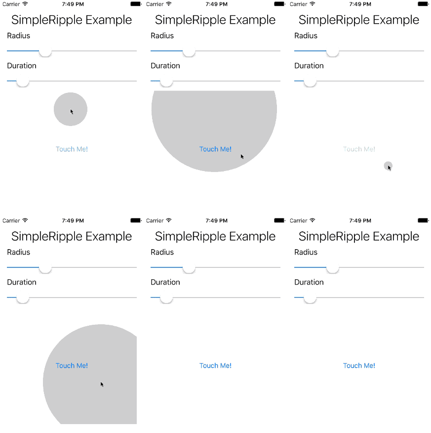
In this repository you can find the full implementation full with comments and an example application. The example consists of two sliders that will control the ripple’s duration and radius and a button to test it out. If you look closer (and not that closer, really) you can also see that the two sliders will also show a ripple when they are touched.

The Example App
If you find any bugs or can think of improvements please feel free to submit a pull request.
Conclusion
Replicating what Google did with Material Design on iOS was pretty
straightforward. All it took was creating two CABasicAnimation and adding
them to a new sublayer in the desired UIView. Categories in Objective-C
(or Extensions in Swift) also help make the core more generic and easier to
use.